
Python Data Visualization Cookbook#1 - Market Data
No More Expensive Boomberg/TC2000/TradingView Subscriptions. Everything Can Be Done In Python!

Data visualization is vital for algo traders, turning complex data into actionable insights. It enables quick pattern recognition, strategy validation, and risk management by presenting trends, anomalies, and opportunities clearly.
Visual tools are essential for detecting data issues like missing values, outliers, or anomalies that can corrupt your backtests.
Essential visualizations for algo traders are candlestick charts for price analysis, heat maps for correlations, scatter plots for factor analysis, and line charts for strategy metrics. These tools transform market data into actionable insights, vital for modern quantitative trading.
To run the Python code in this post, you need to install required libraries using the following command:
!pip install matplotlib seaborn pandas numpy scipy plotly mplfinance yfinance --quietBelow are my top charts and the use cases to help my algo strategy development.
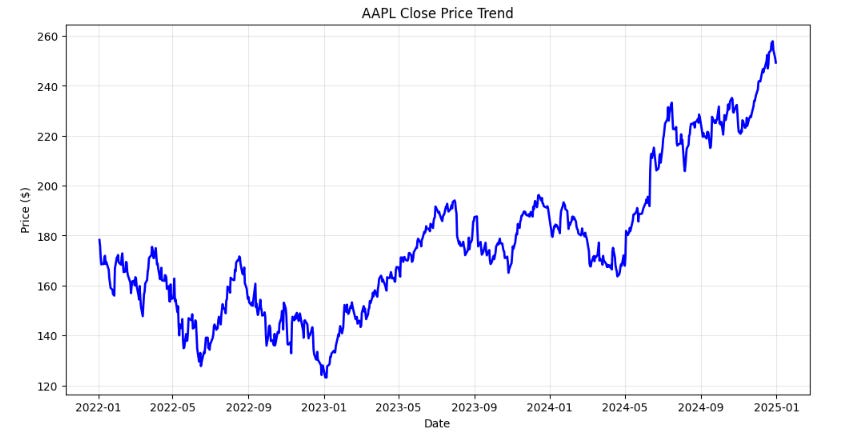
1 - Line Chart - Close Prices
Use Case: Fundamental price trend visualization for any security over time.
When to Use: Daily analysis, identifying overall market direction, and basic trend recognition.
Importance (9/10): The foundation of all technical analysis.
import yfinance as yf
import matplotlib.pyplot as plt
import seaborn as sns

# Fetch data
ticker = "AAPL"
data = yf.download(ticker, start="2022-01-01", end="2025-01-01")

# Basic Line Chart
plt.figure(figsize=(12, 6))
plt.plot(data.index, data['Close'], linewidth=2, color='blue')
plt.title(f'{ticker} Close Price Trend')
plt.xlabel('Date')
plt.ylabel('Price ($)')
plt.grid(True, alpha=0.3)
plt.show()
2. Detailed OHLC Chart With Volume - Close Prices
Use Case: Detailed OHLC and trading volume analysis for intraday and swing trading decisions.
When to Use: Pattern recognition, reversal identification, and precise entry/exit timing. Confirming price movements and identifying accumulation/distribution phases.
Importance (10/10): Essential for technical pattern analysis.
import yfinance as yf
import mplfinance as mpf

# Download AAPL data
data = yf.download("AAPL", period="6mo", interval="1d")

# Reset index to use Date as a column
data.columns = data.columns.get_level_values(0)

# Plot candlestick chart with volume
mpf.plot(data, type="candle", volume=True, title="AAPL Stock Price", style="yahoo", figratio=(16,9), figscale=1.5)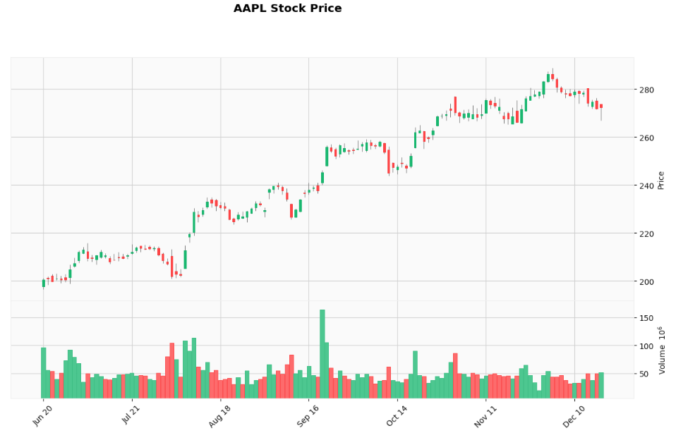
3. Volume Profile
Use Case: Identifying price levels with highest trading activity (value areas).
When to Use: Support/resistance level identification and fair value analysis.
Importance (8/10): High-volume price levels, value areas, and key support/resistance zones.
import yfinance as yf
import matplotlib.pyplot as plt
import numpy as np

# Download AAPL data
data = yf.download("AAPL", period="6mo", interval="1d")

# Reset index to use Date as a column
data.columns = data.columns.get_level_values(0)

# Volume Profile
price_bins = np.linspace(data['Close'].min(), data['Close'].max(), 50)
volume_profile = []

for i in range(len(price_bins)-1):
    mask = (data['Close'] >= price_bins[i]) & (data['Close'] < price_bins[i+1])
    volume_profile.append(data.loc[mask, 'Volume'].sum())

plt.figure(figsize=(8, 10))
plt.barh(price_bins[:-1], volume_profile, height=(price_bins[1]-price_bins[0])*0.8)
plt.xlabel('Volume')
plt.ylabel('Price ($)')
plt.title(f'{ticker} Volume Profile')
plt.grid(True, alpha=0.3)
plt.show()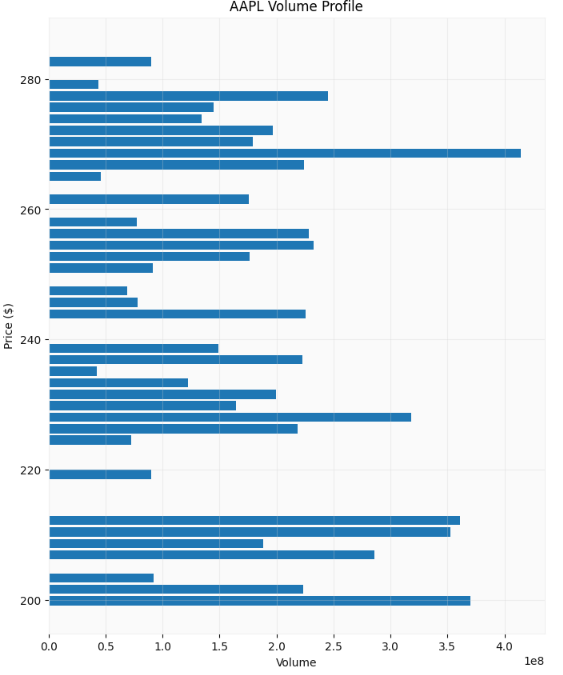
4. Simple Moving Average (SMA)
Use Case: Trend identification and smoothing price noise for clearer trend analysis.
When to Use: Trend following strategies, support/resistance levels, and signal generation.
Importance (9/10): Foundation of many trading strategies.
import yfinance as yf
import mplfinance as mpf

# Download AAPL data
data = yf.download("AAPL", period="6mo", interval="1d")

# Reset index to use Date as a column
data.columns = data.columns.get_level_values(0)

# Plot candlestick chart with volume
mpf.plot(data, type="candle", volume=True, mav=(10, 20), title="AAPL Candlestick Chart with SMA10 & SMA20", style="yahoo", figratio=(16,9), figscale=1.5)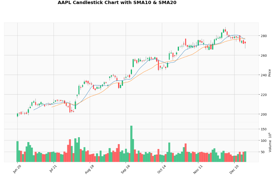
5. Exponential Moving Average (EMA)
Use Case: More responsive trend following with recent price emphasis.
When to Use: Faster signal generation and reduced lag in trending markets.
Importance (9/10): Preferred by active traders for responsiveness.
import yfinance as yf
import mplfinance as mpf

# Download AAPL data
data = yf.download("AAPL", period="6mo", interval="1d")

# Reset index to use Date as a column
data.columns = data.columns.get_level_values(0)

# Calculate EMAs
data['EMA10'] = data['Close'].ewm(span=10, adjust=False).mean()
data['EMA20'] = data['Close'].ewm(span=20, adjust=False).mean()

# Define additional plots for EMAs
ema10 = mpf.make_addplot(data['EMA10'], color='blue', label='EMA 10', width=0.5)
ema20 = mpf.make_addplot(data['EMA20'], color='orange', label='EMA 20', width=0.5)

# Plot candlestick chart with EMAs
mpf.plot(data, type='candle', title=f'AAPL Candlestick Chart with EMA10 & EMA20',
         ylabel='Price', addplot=[ema10, ema20], style='yahoo', volume=True, figratio=(16,9), figscale=1.5)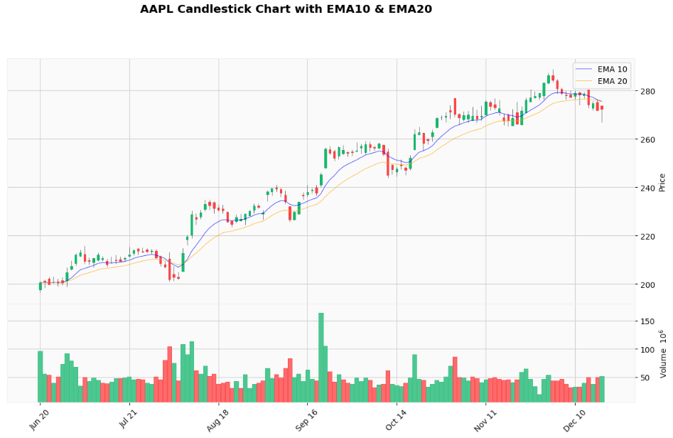
6. Moving Average Convergence (MACD)
Use Case: Trend following and momentum analysis through moving average convergence/divergence.
When to Use: Signal line crossovers, histogram analysis, and trend confirmation.
Importance (9/10): Premier trend-following momentum indicator.
import yfinance as yf
import mplfinance as mpf

# Download AAPL data
data = yf.download("AAPL", period="6mo", interval="1d")

# Reset index to use Date as a column
data.columns = data.columns.get_level_values(0)

# Calculate MACD
def calculate_macd(data, fast=12, slow=26, signal=9):
    exp1 = data['Close'].ewm(span=fast, adjust=False).mean()
    exp2 = data['Close'].ewm(span=slow, adjust=False).mean()
    macd = exp1 - exp2
    signal_line = macd.ewm(span=signal, adjust=False).mean()
    histogram = macd - signal_line
    return macd, signal_line, histogram

data['MACD'], data['Signal'], data['Histogram'] = calculate_macd(data)

# Prepare additional plots for MACD
macd_plot = mpf.make_addplot(data['MACD'], panel=1, color='blue', label='MACD', width=0.5)
signal_plot = mpf.make_addplot(data['Signal'], panel=1, color='orange', label='Signal', width=0.5)
histogram_plot = mpf.make_addplot(data['Histogram'], panel=1, type='bar', color='gray', label='Histogram')

# Plot candlestick chart with MACD
mpf.plot(data, type='candle', title=f'AAPL Candlestick Chart with MACD',
         ylabel='Price', addplot=[macd_plot, signal_plot, histogram_plot],
         style='yahoo', volume=False, mav=(12, 26), figratio=(16,9), figscale=1.5)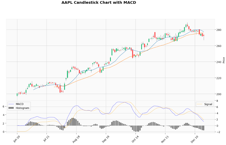
7. Bollinger Bands
Use Case: Volatility analysis and overbought/oversold identification using standard deviation bands.
When to Use: Mean reversion strategies, volatility analysis, and breakout identification.
Importance (9/10): Essential volatility and mean reversion tool.
import yfinance as yf
import mplfinance as mpf

# Download AAPL data
data = yf.download("AAPL", period="6mo", interval="1d")

# Reset index to use Date as a column
data.columns = data.columns.get_level_values(0)


# Calculate Bollinger Bands
def calculate_bollinger_bands(data, window=10, num_std=2):
    sma = data['Close'].rolling(window=window).mean()
    std = data['Close'].rolling(window=window).std()
    upper_band = sma + (std * num_std)
    lower_band = sma - (std * num_std)
    return sma, upper_band, lower_band

data['SMA'], data['Upper_Band'], data['Lower_Band'] = calculate_bollinger_bands(data)

# Prepare additional plots for Bollinger Bands
sma_plot = mpf.make_addplot(data['SMA'], color='blue', label='SMA 10', width=0.5)
upper_band_plot = mpf.make_addplot(data['Upper_Band'], color='grey', label='Upper Band', width=0.5)
lower_band_plot = mpf.make_addplot(data['Lower_Band'], color='grey', label='Lower Band', width=0.5)

# Define fill between Upper and Lower Bollinger Bands
fill_bb = dict(y1=data['Upper_Band'].values, y2=data['Lower_Band'].values, color="grey", alpha=0.1)

# Plot candlestick chart with Bollinger Bands and filled area
mpf.plot(data, type='candle', title=f'AAPL Candlestick Chart with Bollinger Bands',
         ylabel='Price', addplot=[sma_plot, upper_band_plot, lower_band_plot],
         style='yahoo', volume=True, fill_between=fill_bb, figratio=(16,9), figscale=1.5)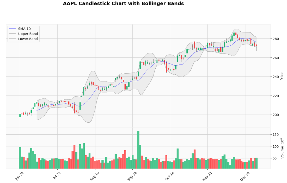
8. Average True Range (ATR) Chart
Use Case: Measuring true price volatility accounting for gaps and limit moves.
When to Use: Position sizing, stop-loss placement, and volatility-based strategies.
Importance (9/10): Essential for risk management and position sizing.
import yfinance as yf
import mplfinance as mpf
import pandas as pd

# Download AAPL data
data = yf.download("AAPL", period="6mo", interval="1d")

# Reset index to use Date as a column
data.columns = data.columns.get_level_values(0)


# Calculate ATR
def calculate_atr(data, period=14):
    high_low = data['High'] - data['Low']
    high_close = abs(data['High'] - data['Close'].shift())
    low_close = abs(data['Low'] - data['Close'].shift())
    true_range = pd.concat([high_low, high_close, low_close], axis=1).max(axis=1)
    atr = true_range.rolling(window=period).mean()
    return atr

data['ATR'] = calculate_atr(data)

# Prepare additional plot for ATR
atr_plot = mpf.make_addplot(data['ATR'], panel=1, color='purple', label='ATR (14)', width=0.8)

# Plot candlestick chart with ATR
mpf.plot(data, type='candle', title=f'AAPL Candlestick Chart with ATR',
         ylabel='Price', ylabel_lower='ATR', addplot=[atr_plot],
         style='yahoo', volume=True, panel_ratios=(3,1), figratio=(16,9), figscale=1.5)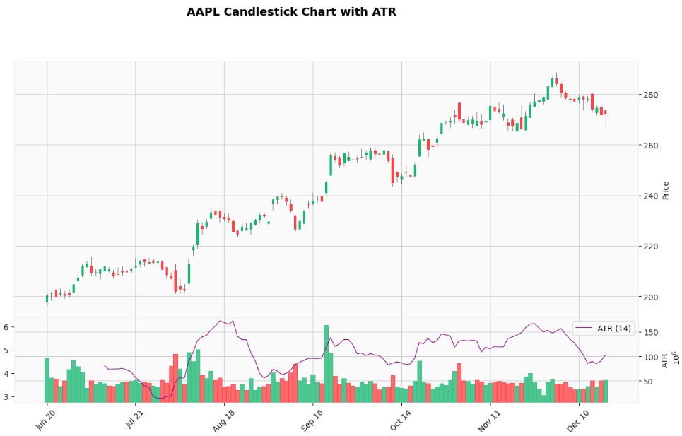
⚠️ Disclaimer: The content provided is intended solely for educational purposes and reflects the author’s personal experiences with data insights, backtesting and algorithmic trading. It does not constitute financial advice, investment recommendations, or financial services. All references to securities or financial instruments are for illustrative purposes only and should not be construed as endorsements or recommendations for trading. Performance figures presented are based on hypothetical backtested results, which are not indicative of future performance. Trading systems may contain errors, and no warranties are made regarding their accuracy or functionality. Past performance does not guarantee future results. Individuals are strongly advised to conduct thorough due diligence, including but not limit to forward testing in paper or simulated accounts for an appropriate duration, before deploying any trading strategy with real capital. Trading carries significant risks, including high volatility and the potential for complete loss of invested capital. Live trade the strategy at your own risk, as any losses incurred are not the responsibility of the author.
🚨 Don’t Want To Setup Your Python Environment?
You can get my Python source code in Google Colab to run remotely. The complete source code in Google Colab is available for Paid members
BONUS For Paid Member ONLY - “Champion’s Fast Lane Playbook: Master Algo Trading in 12 Weeks” - My 8 modules self-study guides and notes for building a winning strategy.
⬇️⬇️⬇️